UX Design Best Practices for Lead Generation in 2024

In today's digital era, effective lead generation heavily relies on the quality of website design. User Experience (UX) plays a pivotal role in shaping the outcome of these strategies. This article will discuss the importance of UX design in lead generation and enumerate best practices for maximizing effectiveness. By prioritizing simplicity, valuable content, and a seamless user experience, you can attract more leads and drive conversions.
What is Lead Generation
 Lead generation is the process of finding and attracting potential customers for a business. It involves identifying and targeting people or companies that might be interested in your products or services and guiding them through the early stages of the sales process. The main goal of lead generation is to create a steady flow of qualified leads - people or companies that have shown interest and may be ready to make a purchase. Leads are crucial for businesses to keep growing, as they represent future revenue opportunities.
Importance of Lead Generation
Lead generation plays a key role in the success of any business, especially in today's competitive digital world. Here are some reasons why it's important:
- Sales and Revenue Growth: A steady flow of new leads means there are always potential customers waiting, which helps drive sales and revenue.
- Cost-Effective Marketing: Targeted lead generation efforts allow businesses to invest in the right people or companies, which means they get more value for their budget.
- Improved Customer Acquisition: When businesses nurture leads effectively, they can identify the best prospects, making them more likely to turn into customers.
- Competitive Advantage: Effective lead generation strategies help businesses reach potential customers early in their buying journey, giving them an edge over competitors.
- Customer Insights: Lead generation involves collecting insights about your audience, which helps improve marketing, product development, and overall business decisions.
The Role of UX in Lead Generation
User experience plays a crucial role in successful lead generation. A well-designed and easy-to-use website, landing pages, and online forms can significantly impact a visitor's decision to engage with a business and share their personal information. Here are four UX design best practices you can implement to boost your lead generation strategy:
1. Simple Navigation
Clear and straightforward navigation guides users smoothly through the lead-generation process. A simple structure allows potential leads to find what they need and take the desired actions quickly.
Keep It Simple
Keep your website design simple and avoid overwhelming users with too many options. Instead, highlight the most essential pages and features that drive conversions.
- Streamlined Menu
Make sure your menu makes sense to users by grouping things logically and using clear, simple labels that indicate what each link does. Keep the main menu short—no more than seven items—because too many choices can be overwhelming.
- Prominent Call-to-Action (CTA)
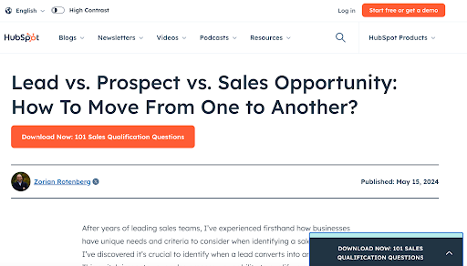
Your primary CTA, such as Request a Demo or Get Started, should be prominently displayed and easy to find on every page. That way, users can reach out to you right away without having to click too many options or navigate through multiple pages. In this example from Hubspot, the CTA is bolder in color than the rest of the text on the page, making it more noticeable and inviting users to take action. 
- Breadcrumb Navigation
Use breadcrumb navigation to show users where they are within the website's hierarchy. This navigation is handy for websites with multiple sections, making it easy for users to find their way back to the main pages.
Make It Mobile-Friendly
Make sure your website works well on different screen sizes, such as mobile phones and tablets. Consider using a hamburger menu or trying other ways to save space while ensuring users can navigate easily.
| Mobile Navigation Options | Description |
|---|---|
| Hamburger Menu | A small menu icon with three horizontal lines that users can click on to see the navigation options |
| Dropdown Menus | Nested menus that open up more options when you click on the main one, saving space on the screen |
| Sticky Navigation | A navigation bar that remains visible as users scroll down the page |
Test and Optimize
Continuously monitor how people use your website and find ways to improve it. Try A/B testing to compare different navigation layouts and use the results to make decisions. Analytics tools can also track what users do on your website and reveal where they're getting lost or stuck, so you can make the navigation easier and get more leads. Keep things simple, use clear menus, and pay attention to how people use your website to make it even better. Following these steps can turn potential leads into satisfied customers.
2. Engaging Content
To turn website visitors into leads, you need content that grabs their attention and provides real value. By understanding your audience and creating content tailored to their needs, you can build trust, showcase your expertise, and inspire them to take action.
Know Your Audience
Before you start writing, take the time to understand your target audience. Find out their struggles, what they want to achieve, and what they like. This insight will help you create content that speaks to and helps solve their problems.
- Develop Buyer Personas
Create detailed profiles of your ideal customers, known as buyer personas. These profiles typically include demographic information, job roles, pain points, and buying behaviors. Then, use these personas to help you craft content that they’ll care about and want to read.
- Conduct Keyword Research
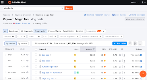
Use tools like Semrush, Ahrefs, or Google Keyword Planner to identify the keywords your target customers use when searching for information related to your products or services. Then, incorporate these keywords into your content to improve its visibility in search engine results and attract more potential leads. 
Create Engaging Content
Craft content that engages and educates your audience while leading them toward becoming potential customers.
- Offer Real Value
Focus on creating content that provides genuine value to your audience. Some examples include educational resources, industry insights, how-to guides, or case studies that showcase your expertise.
- Tell Stories
Engage your audience by weaving narratives into your content. Storytelling helps make complex topics more relatable and memorable while also helping your audience build a connection with your brand.
- Make It Easy to Read
Structure your content to make it easy to read. Use clear headings, short paragraphs, bullet points, and visuals to break up text and highlight important information. This way, visitors are more likely to read your content and find what they need, which can help turn them into customers.
- Include Calls-to-Action (CTAs)
Put CTAs in your content to encourage users to contact you. Whether signing up for a newsletter, downloading a resource, or requesting a demo, make sure these CTAs stand out and match your content.
Use Different Content Formats
Investing in a comprehensive content strategy pays off. Try using various content types to match what different people like to read or watch, such as:
| Content Format | Description |
|---|---|
| Blog Posts | Regularly published articles that provide insights, tips, and expert advice about your industry |
| White Papers and E-books | In-depth resources that delve into specific topics or solutions |
| Webinars and Podcasts | Interactive content that lets you engage live with your audience, like Question and Answer (Q&A) sessions |
| Infographics and Videos | Visually appealing formats that display complex information in a concise and engaging way |
Creating content that connects with your audience and provides value can build trust, establish your expertise, and help potential leads become satisfied customers.
3. Easy Forms
Forms are essential in lead generation, but complex or lengthy ones can frustrate users and cause them to abandon the process. To get more leads, make sure your forms are straightforward and user-friendly.
Minimize Required Fields
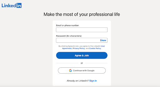
Keep your forms concise by only asking for the information you need right away. Adding more questions makes it harder for people to complete the form. Stick to fields like name, email, and phone number. Avoid asking for details you can find out later in the process. This LinkedIn example simplifies the sign-up process by requiring only two things: an email or phone number and a password. 
Autofill and Intelligent Formatting
Use autofill for standard fields like name, email, and address to help users fill out forms faster. You can also implement intelligent formatting to automatically input phone numbers, dates, and credit card information, which improves the user experience and reduces errors.
Multi-Step Forms
For longer forms, consider breaking them down into multiple steps or pages to make the process feel less overwhelming. Indicate progress and the remaining number of steps to set expectations.
Inline Validation
Inline validation gives users real-time feedback as they fill out a form, helping them correct errors immediately. This makes it less frustrating and more likely that they'll finish the form correctly.
Mobile-Friendly Design
As more people use mobile phones, make sure your forms work well on small devices. Make buttons big enough to tap easily and minimize the need for typing by using input masks, dropdown menus, and date pickers. By following these tips, you can create simple, user-friendly forms that streamline the lead generation process, improve the user experience, and increase conversions.
4. Testing and Analytics
Improving the user experience is essential for generating more leads. A/B tests and analytics give you insights into refining your UX design and converting more people into customers.
A/B Testing to Optimize UX
A/B testing lets you compare different versions of your website or landing pages to see which ones work best. By testing layout, copy, forms, and calls to action, you can identify what makes more people want to become customers and apply the appropriate changes.
- Step 1: Identify Elements to Test
Start by figuring out areas that may affect the user journey, such as:
- Headlines and messaging
- Form fields and layouts
- CTA buttons (text, color, placement)
- Navigation and content structure
- Create Variations
For each element of your website, create two or more different versions to test against the one you have now. Make sure you only change one element at a time to see what really makes a difference.
- Run the Test
Use a reputable A/B testing tool to run experiments and collect data like conversion and bounce rates. Make sure you have a large enough sample size for more relevant results.
- Analyze and Implement
Review the data to determine which version performed best for your goals. Implement the winning version, then decide what else you can test and optimize.
Analytics for Continuous Improvement
Besides A/B testing, use website analytics to gain deeper insights into user behavior and identify areas for improvement.
- Conversion Funnel Analysis: Examine drop-off points in your conversion funnel to identify where customers get stuck and leave the process.
- Heatmaps and Session Recordings: Look at heatmaps and session recordings to see how users interact with your site.
- Form Analytics: Analyze how many people leave your forms before finishing, which fields they complete, and if there are any errors.
- User Feedback: Collect feedback through surveys and polls to understand pain points and preferences.
| Analytics Tool | Purpose |
|---|---|
| Google Analytics | Track website traffic, user behavior, and conversion rates. |
| Hotjar | Create heatmaps and session recordings. |
| Zuko | Analyze form performance, field completion, and error rates. |
| SurveyMonkey | Conduct user surveys and gather feedback. |
By constantly testing, measuring, and refining your strategy based on data-driven insights, you can make sure your website works well for the people who use it, bringing in more leads for your business.
Conclusion
Enhancing user experience is critical to attracting and converting leads. By implementing the UX best practices discussed in this guide, you can develop a well-designed website that smoothly guides visitors to become satisfied customers. In addition to a user-friendly website and engaging content, explore other fun ways to generate leads, such as giveaways and contests. These interactive experiences grab people's attention and get them involved, spreading awareness of your brand and effortlessly generating leads. Tools like Raffle Leader make it easy to craft beautiful giveaways and contests and customize them to fit your needs. By embracing a variety of lead generation techniques and using tools effectively, you can create an immersive user experience, increasing your chances of attracting high-quality leads and driving long-term growth.
