The Perfect Youtube Thumbnail Size and Best Practices

As the second most popular social network on the internet, YouTube provides an incredible opportunity to attract viewers and potential customers. However, creating high-quality video content isn't enough; you need to compel people to click on your videos. So, how can you get people to do that? You need an attention-grabbing YouTube thumbnail. YouTube thumbnails are as crucial as video titles to get clicks. They’re the first thing viewers see, helping your video stand out in search results. In this article, we’ll discuss the ideal YouTube thumbnail size, share best practices for creating eye-catching thumbnails, and provide tips to help you attract more views.
What’s the Best YouTube Thumbnail Size?
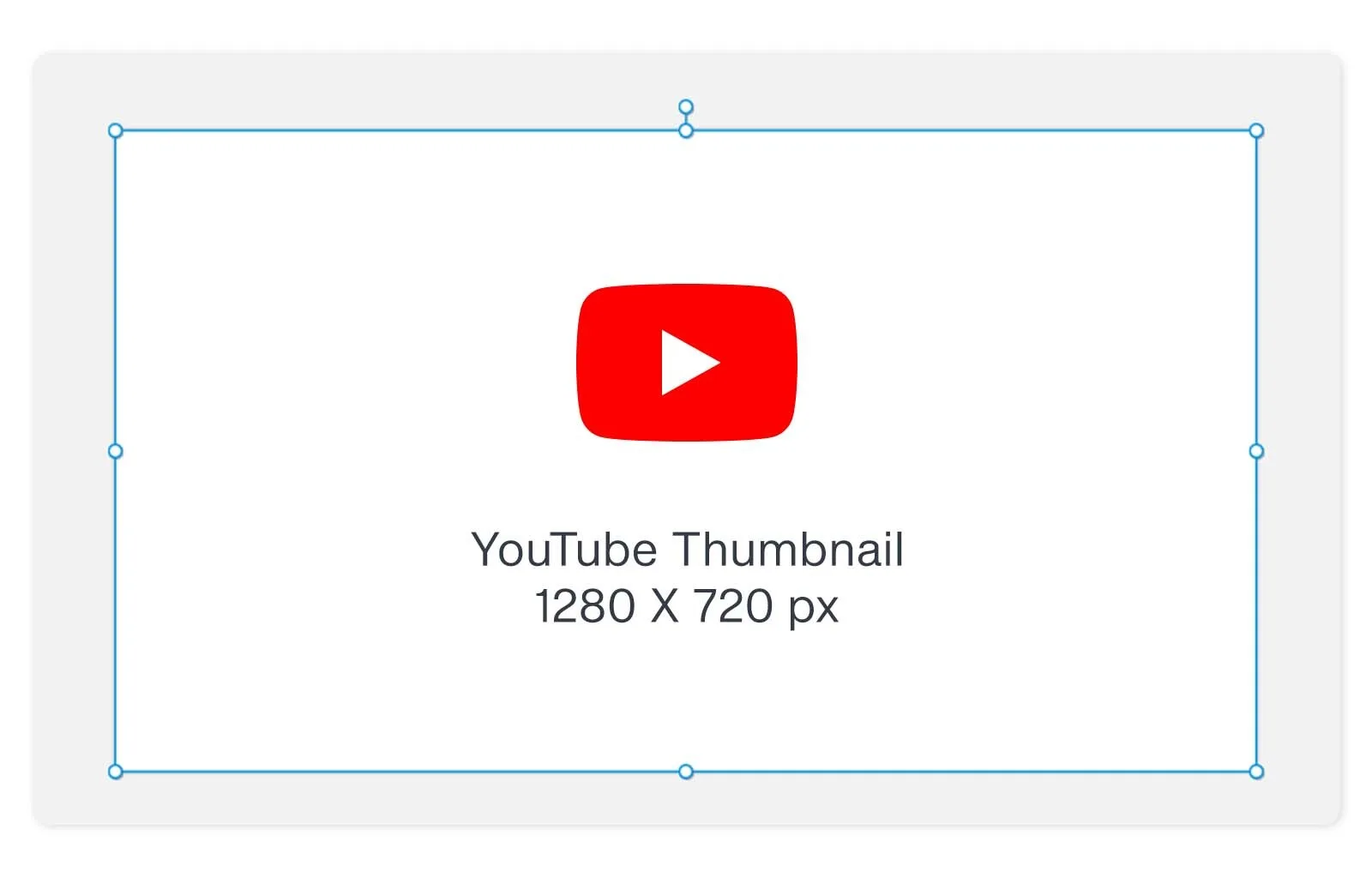 A well-designed YouTube thumbnail can help your video rank higher and attract your target audience. It's important to consider the technical details, such as pixel dimensions, width, and aspect ratio. According to Google's recommendations:
- Aim for a resolution of 1280 x 720 pixels.
- Ensure a minimum width of 640 pixels.
- Maintain an aspect ratio of 16:9.
- Use JPG, GIF, or PNG formats.
- Ensure that thumbnail file sizes don’t exceed 2 MB.
Why 1280 x 720 pixels? Thumbnails act as billboards for your video, so you want them to be sharp and eye-catching. This resolution ensures clarity across all devices, while the 16:9 aspect ratio perfectly fits YouTube's player and preview screens. JPG and PNG file formats also maintain quality while keeping file sizes manageable. Ensure your thumbnail is lightweight yet impactful to avoid long loading times that might deter potential viewers.
What’s the Use of YouTube Thumbnails?
YouTube thumbnails are small images that serve as previews. They are designed to grab attention and encourage viewers to watch the video. Here are some examples of YouTube thumbnails from Google’s official channel: 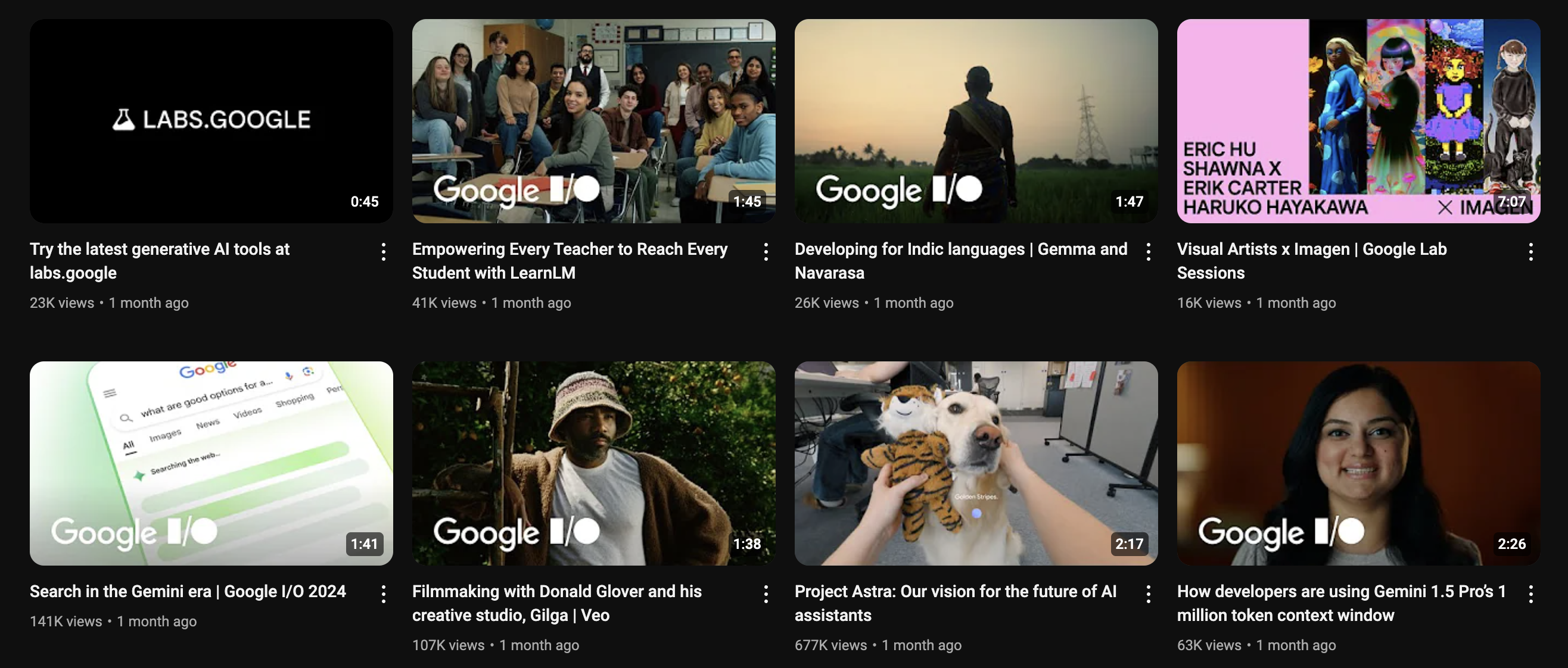 YouTube thumbnails are like book covers, offering a glimpse of the video content to spark interest and curiosity. By incorporating engaging text, contrasting colors, and high-quality images, you can give viewers a preview of what to expect and increase their likelihood of engaging with your content.
Why are YouTube Thumbnails Important?
While the saying goes, "Don’t judge a book by its cover," in reality, most people do. The same applies to YouTube thumbnails; they determine whether your video gets lots of views or goes unnoticed. Fortunately, YouTube lets you customize your video thumbnails. When you upload a video, YouTube generates three still images from your content that you can select as thumbnails. While this is convenient, creating custom YouTube thumbnails is generally more effective. Take a look at these two images from a video on Shopify's YouTube channel. Which one do you think is more likely to grab people's attention?  Or:
Or:  Custom thumbnails set your videos apart and significantly impact audience growth. They’re also an excellent opportunity to align your brand's visual identity. The good thing is thumbnail images are easy to create. After all the effort spent planning, filming, and editing your YouTube video, dedicating a little extra time to designing custom thumbnails should be a breeze.
How to Add a Custom Thumbnail to Your YouTube Video
Below is a quick guide on uploading your custom thumbnail image. To begin, go to YouTube and click the camera-plus icon on the upper right-hand side of the screen to upload a new video. If you want to add a custom thumbnail to a video you've already uploaded, navigate to your videos in the YouTube Studio dashboard. Then, click on the video to access its settings. 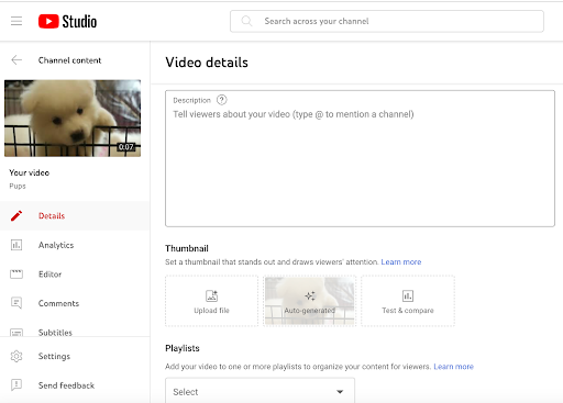 In the video settings, you'll find automatically generated thumbnails. You'll also find an option to upload your custom YouTube thumbnail. Simply click “Upload file,” then choose your image from your device.
Best Practices for Creating YouTube Thumbnails
-
Use a Still Image from Your Video
This is the simplest type of YouTube thumbnail. Sometimes, YouTube may have already chosen the perfect still image from your video to use as a thumbnail. If not, you can export a specific still image using video editing software. If you're updating thumbnails for old YouTube videos and don’t have the original video file, you can pause the video on a frame you like, switch to full-screen mode, and then take a screenshot. You can use plain images or add text, like in this video from Lululemon, which tells the story of runners who spent three days in the desert. This is also a fantastic example of the effective use of negative space. Creating space around the subjects in your thumbnail ensures that the image doesn’t look cluttered and keeps the focus on the key visual components, making for a cleaner, more striking design. 
-
Create a Custom Image
Many brands create image thumbnails that accurately reflect the video content, often with a short title summarizing the video’s main benefit along with the brand’s name or logo. Including your brand name or logo in your YouTube thumbnail enhances your brand’s visibility online and boosts viral reach. Consistently placing it in a specific spot ensures a uniform appearance, contributing to a recognizable brand identity. This makes your channel more cohesive and enhances visual appeal, helping viewers to quickly identify your content. For example, Headspace always positions its logo in the lower-left corner of each YouTube thumbnail image. 
-
Combine Graphics with Video Stills
Combine graphic elements with a video still to create eye-catching thumbnails. This is particularly effective for videos featuring people, such as tutorials, vlogs, or talk shows, as it makes your thumbnail stand out and provides viewers with a preview of the content. Contrasting colors also significantly enhance the effectiveness of your thumbnails by making text and graphics stand out against the background. For example, Vogue uses bold, contrasting colors and engaging visuals in a YouTube thumbnail with Emma Chamberlain discussing top fashion trends. This captures the eye and reinforces the video's theme, appealing to potential viewers. 
-
Write Compelling Titles
Your video title is one of the most critical elements of your YouTube video. Integrating your title into the thumbnail is equally essential. A catchy and concise title can make a significant difference, attracting viewers and giving them a preview of your video without them having to click. Moreover, ensure your thumbnail text is easily readable. If viewers struggle to read it, they are less likely to click. Remember, many users access YouTube from mobile devices, where clear text on a desktop might appear illegible. A good example is this YouTube thumbnail from Davie Fogarty, which includes the text "How to Run Facebook Ads for Beginners." This clearly indicates that the video is a guide for beginners on running Facebook ads. 
-
Ensure Your Thumbnails and Titles are Accurate
Avoid clickbait tactics by ensuring your YouTube thumbnails and titles accurately represent your video's content. Misleading viewers can undermine their trust and lead them to click away, impacting your audience retention score—a critical metric for YouTube's algorithm. If viewers feel misled and leave early, it can significantly affect your channel's performance. To build a loyal audience and improve retention, always use images and titles that resonate with your target audience and refrain from using copyrighted material without permission.
-
Experiment with Different Thumbnail Designs
Experiment with various thumbnail designs to discover what resonates with your audience. Choose a design you like, apply it to a top-performing video, and monitor the results. If the click-through rate improves after the change, you've found a design that resonates better with your audience. The advantage of testing is that you can continue experimenting with different designs, provided the videos you use have enough data to work with. For better insights, focus on videos with significant traffic. Videos receiving just a few clicks a week or a month won't provide reliable results.
3 Free Tools for Creating YouTube Thumbnails
There are plenty of excellent tools that can help you create eye-catching YouTube thumbnails. Here's a quick look at three top design tools with advanced photo editing features:
Canva is a widely used online graphic design tool perfect for creating stunning YouTube thumbnails. It offers millions of templates and an extensive media library, making it easy to bring your creative vision to life. The best part? Canva is free to use. You get 5GB of cloud storage, plus access to over 1 million professionally designed templates and over 3 million stock photos and graphics. For $119.99 a year, you can upgrade to Canva Pro for more advanced features.
Figma is a powerful graphic design tool that covers everything from prototyping to complete designs. Although it lacks specific templates for YouTube thumbnails, its features allow you to design stunning thumbnails from scratch. The Starter package is free and includes unlimited personal drafts, but you'll need to pay $15 monthly for unlimited Figma files and additional features.
PicMonkey is a user-friendly online tool for designing impactful YouTube thumbnails. It features resizing, cropping, and color adjustment capabilities, along with a variety of templates designed specifically for YouTube thumbnails. As part of Shutterstock, you also benefit from access to high-quality, licensed photographs, vectors, illustrations, and more. The Basic package costs $72 per year, while the Pro package, which includes unlimited storage and brand fonts, costs $120 annually.
