15 Best Coming Soon Landing Page Examples
Are you planning to launch something new? Integrating a coming soon page into your website is a smart tactic to drum up excitement and anticipation ahead of a launch. Whether teasing a new product line, preparing for a grand opening, or undergoing a rebrand, these pages effectively spark interest and gather valuable leads. Although coming soon pages can effectively advertise and promote your new brand; it's essential to consider certain factors when designing one to maximize its impact. In this article, we’ll define the purpose of a coming soon page, highlight its importance, and list 15 outstanding examples to inspire your own designs.
Why Do You Need a Coming Soon Page?
A coming soon page, also known as a pre-launch page, is a landing page that generates anticipation and excitement for your upcoming brand, product, or website before it launches. By creating awareness, a coming soon landing page establishes your brand's presence, enhances engagement, and provides an early opportunity to build a list of potential customers. Publishing a coming soon page helps you:
To grab attention instantly
Imagine this: you stumble upon a website and suddenly encounter a captivating coming soon landing page. It's like discovering an enticing movie trailer—immediately sparking curiosity and seizing your attention. A well-designed page teases visitors with just enough information to get them excited without giving everything away.
To generate leads early
A coming soon page is the perfect place to build your email list before your full website launches. By offering something valuable, like an exclusive sneak peek or a discount, you can get visitors to sign up and keep them in the loop about your launch.
To build brand awareness
A coming soon landing page is your brand’s first impression, so make it count. It helps establish your brand’s presence early, giving you a head start in market recognition. Your visitors associate your brand with something new and exciting, creating buzz and anticipation.
To get a headstart on SEO
Don’t underestimate the power of search engine optimization (SEO). A coming soon page allows you to build your ranking before your entire website is live. By optimizing content with keywords like “coming soon landing page,” you’re laying down the groundwork for better visibility when your site officially launches.
To keep the momentum alive
Launching a new product or service involves lots of behind-the-scenes work. A coming soon page keeps the momentum going when you’re still in the development phase. It keeps you engaged with your audience, updates them on your progress, and fuels their excitement.
To get valuable feedback
Feedback is gold, and a coming soon landing page is a great way to collect it. Encourage visitors to share their thoughts and suggestions about what they want to see. This input can be invaluable in perfecting your final product.
To create social proof
People love to follow the crowd. Your coming soon page can create a sense of social proof by displaying the number of sign-ups or showcasing early testimonials. It’s like saying, “Look, others are excited about this; you should be too!”
To manage expectations
Being transparent about your launch timeline builds trust. A coming soon page lets you set realistic expectations about when your offering will be available. This way, you manage visitor anticipation without causing frustration.
15 Best Coming Soon Landing Page Examples
1. Tapster
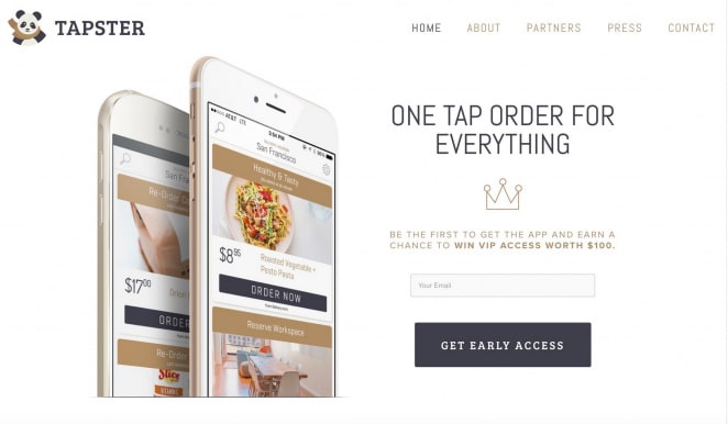 Tapster revolutionizes convenience by enabling you to do everything from ordering food and booking a cab to scheduling a hair stylist or massage with a single tap. They’ve employed a brilliant strategy on their coming soon page by combining the promise of early access to their app with a chance to win a $100 prize. This dual incentive builds anticipation and engages visitors effectively, making them eager to participate and convert. Raffle Leader helps you craft a similar sweepstake tailored to your brand. Customize every aspect of your giveaway or contest and effortlessly manage entries, winners, and engagement. Streamline the process with intuitive controls and analytics to track performance, ensuring your campaign achieves maximum impact and success.
2. Slidescamp
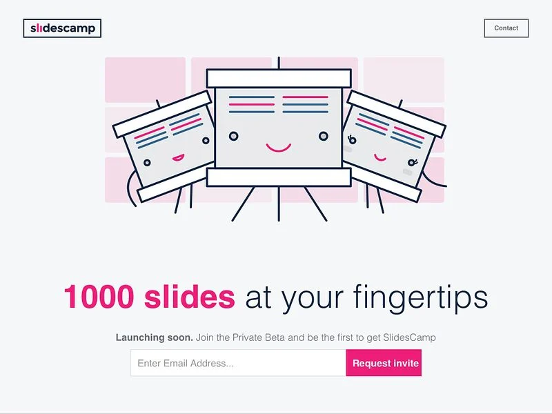 Slidescamp's coming soon page prominently features its core value proposition: access to a library of one thousand pre-designed slides. When crafting a powerful brand promise for your landing page, it's essential to identify and emphasize the most impactful words. Slidescamp effectively highlights "1000 slides," ensuring their primary selling point is boldly communicated. This strategy enhances clarity and captures visitor interest more effectively.
3. Bezar
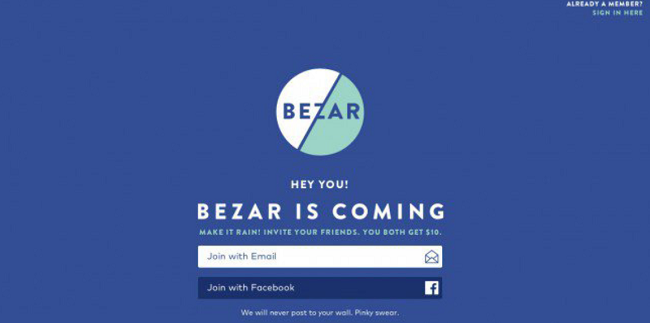 Bezar, a dynamic design marketplace, provides valuable insights for crafting effective coming soon pages. By offering $10 incentives to both referrers and their friends, they ignited rapid word-of-mouth promotion that often goes viral. This approach not only encourages sharing but also significantly expands potential audience reach. Bezar’s referral promotion strategy effectively drives website traffic, boosts user acquisition, and enhances brand visibility.
4. App Manager 5.0
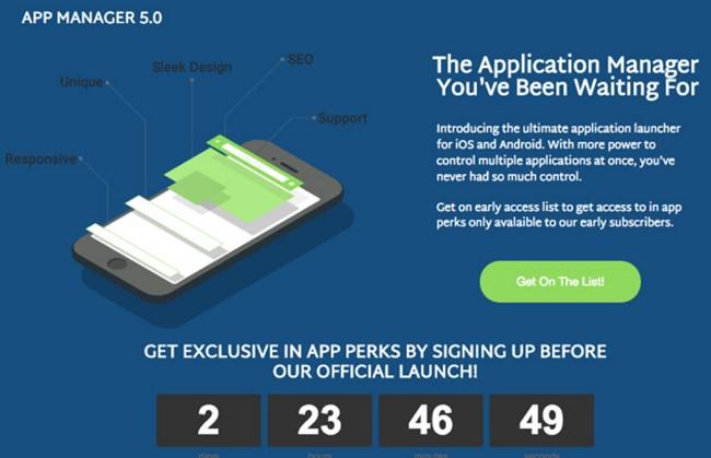 App Manager 5.0’s coming soon page incorporates all essential elements of an effective coming soon page. It features the brand name prominently, provides a concise description of the upcoming product, and includes an image preview. The countdown timer adds anticipation for the launch, while a prominent green call-to-action button encourages visitors to submit their emails. App Manager 5.0 also sets a high standard for creativity in visual presentation, especially when traditional stock images are unsuitable. They opted for a clear, purposeful graphic that effectively showcases the app’s features, ensuring their message is communicated well while maintaining a unique and polished aesthetic.
5. LandApart
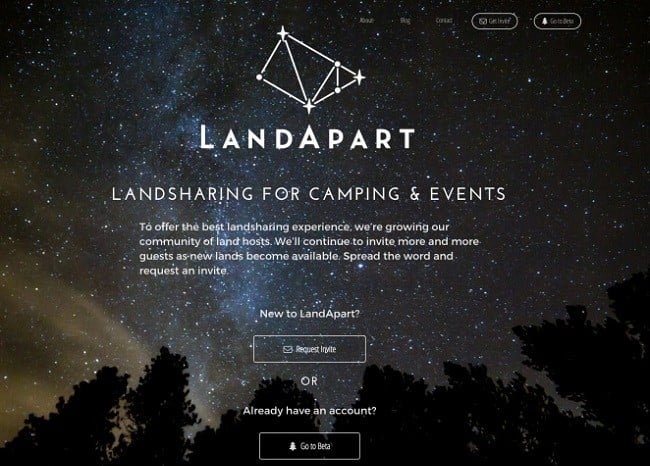 Humans are naturally drawn to exclusivity and scarcity, traits that greatly enhance the appeal of your product or service, as shown by LandApart. Using "Request an Invite" instead of "Joining" on your coming soon page is a powerful tactic to create this sense of scarcity. While private invites may only fit some teams, it's a strategy worth considering if it aligns with your goals.
6. TeekTak
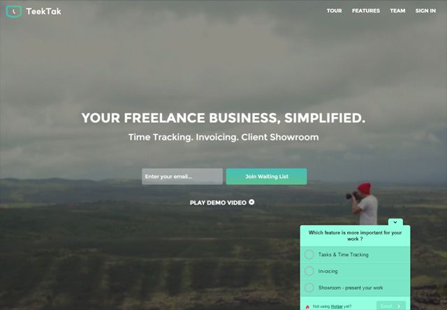 A coming soon page often indicates that your offering is still in development. To gather valuable insights and initiate meaningful dialogue with users before launch, consider integrating a survey tool, like TeekTak. This allows you to collect feedback on essential features directly from your audience. Armed with this data, you can collaborate closely with your development team to refine your product according to user preferences. Adding a simple survey box on your landing page is a practical first step towards ensuring your product resonates with its intended audience, preventing potential mismatches and enhancing its overall appeal.
7. GoBlog
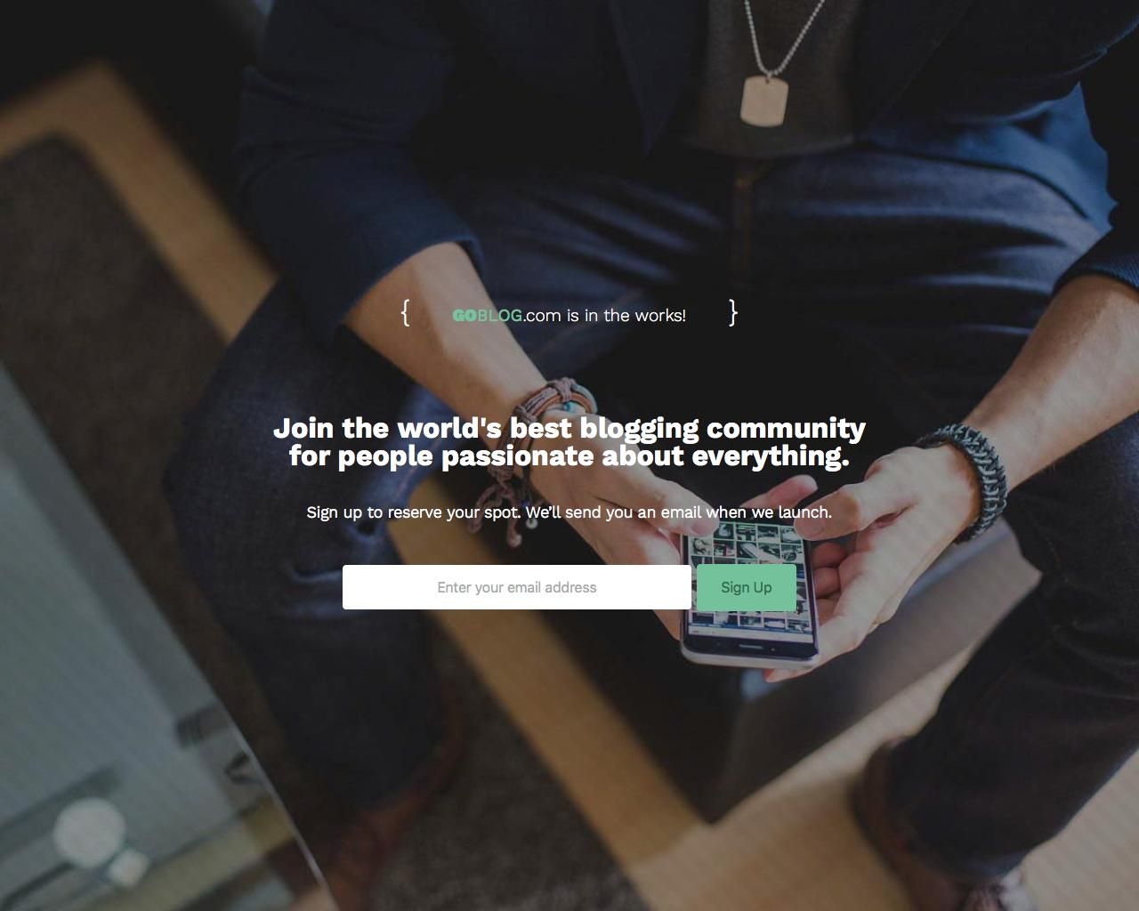 This page excels by aligning its design with the straightforward nature of its offering—a basic blogging platform that doesn't break the bank. It avoids overwhelming visitors with unnecessary details, instead focusing on a concise one-line value proposition that clearly defines the product. The page is refreshingly direct and transparent. It briefly outlines what users can expect by submitting their email and prominently features a single-field form on the page. This minimalist approach is strategically aimed at maximizing conversion rates, which is crucial when enticing users to sign up for an upcoming, presumably free product.
8. Duolingo
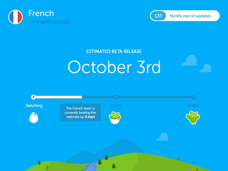 Duolingo, an online language education platform offering free language learning, strategically unveils new courses using a staged production process—from "Hatching" to "Stable"—which they communicate transparently to their users. One thing to take away here is that utilizing visual metaphors such as the owl hatching effectively captures attention and communicates the progress of your launch. Consider creative methods to visually represent the stages remaining in your own process to engage and inform your audience.
9. Panda Doc
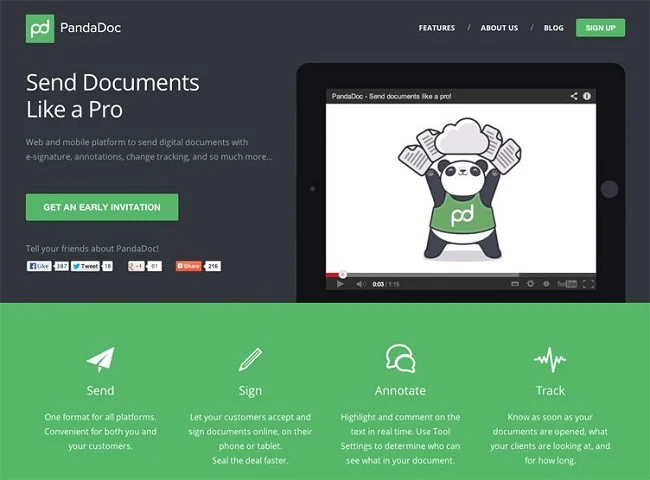 Panda Doc’s coming soon page stands out with an engaging video that effectively captures and retains visitor interest. They intelligently incorporate social links to encourage site sharing and utilize a compelling call to action to generate quick leads. Additionally, leveraging the header and footer to redirect visitors seamlessly enhances navigation and user interaction.
10. Dow Jones
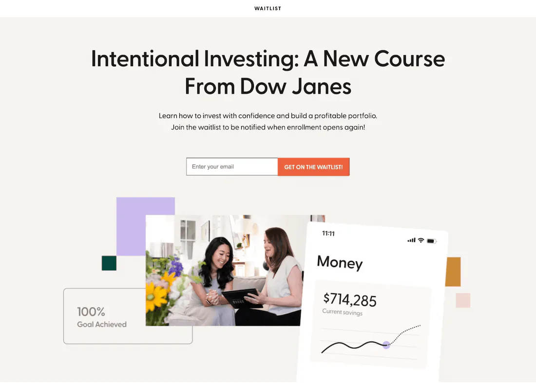 Dow Jones uses a waitlist page, offering a variation on the traditional coming soon landing page. By prompting visitors to "Get on the waitlist," they effectively build anticipation for their upcoming course and encourage early engagement. A standout feature of Dow Jones' approach is its use of custom images. This strategy sets them apart from competitors who typically use stock photos. Custom images maintain brand consistency and foster trust with their audience while vividly illustrating the benefits of their product or service.
11. Jimmy Fairly
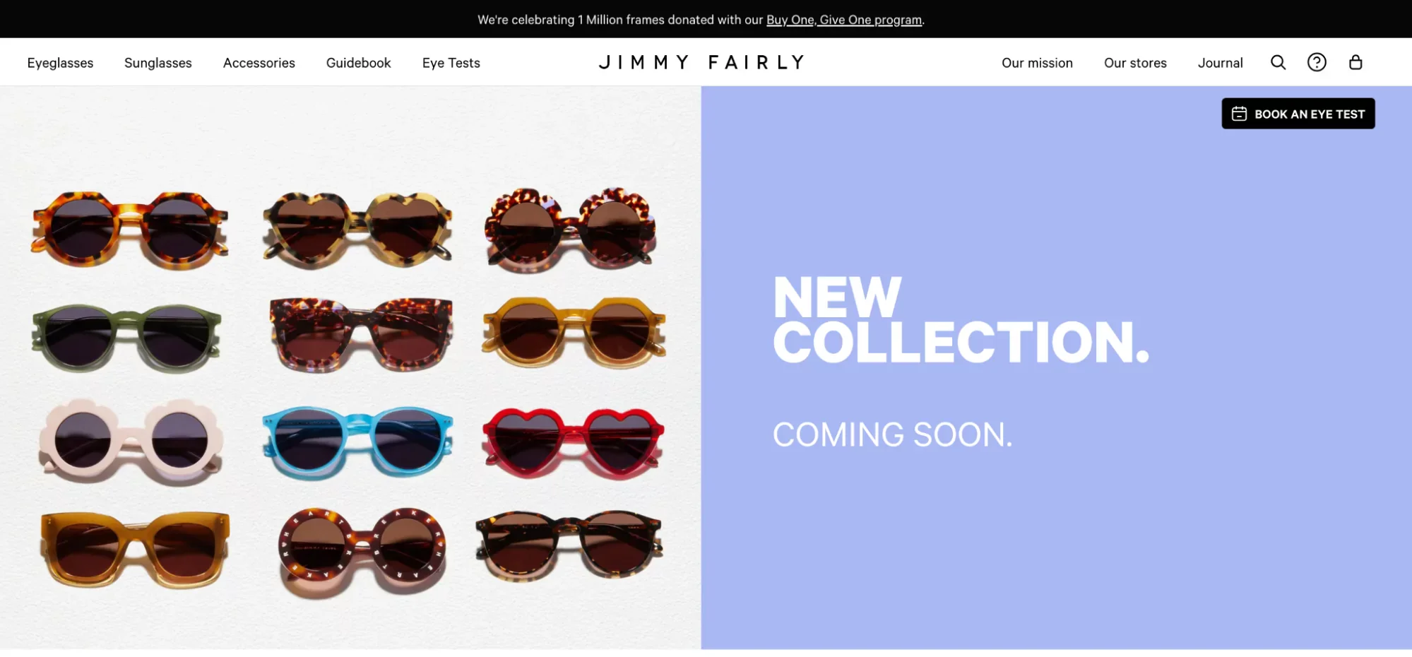 The eyewear brand Jimmy Fairly builds anticipation for its upcoming collection with a bold and minimalist "Coming Soon" header. The standout section of their website showcases each new product with images, allowing customers to preview and get excited about the upcoming launch. This approach is especially effective for brands selling seasonal items such as sunglasses or swimwear. By teasing the summer collection early in the year, brands can engage shoppers and build excitement leading up to the official launch. Emulate this strategy by providing previews that give shoppers a glimpse of what to expect from your upcoming collection or launch. This technique helps generate anticipation and interest among your audience.
12. Beetnut
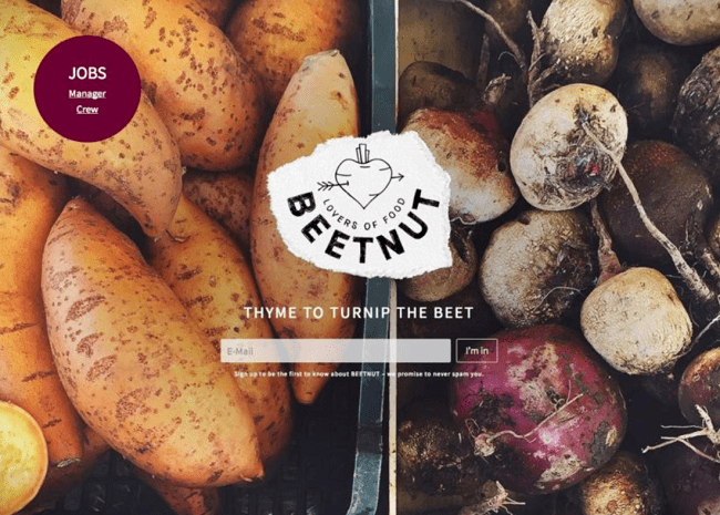 This landing page example is among the best for businesses seeking to recruit staff before their official launch. It stands out for its simplicity and effectiveness, showcasing a basic landing page template with the company logo and an email capture form. Unlike other landing pages that overwhelm with information and complex forms, this one keeps it straightforward. The clever vegetable wordplay adds a fun element to the brand, making it enticing for new email subscribers leading up to the business launch. Easily created using any drag-and-drop builder, this type of landing page is versatile and applicable to any new website or business. Its simplicity is its strength, ensuring effectiveness in capturing and engaging potential recruits or subscribers.
13. Arche Travel Agency
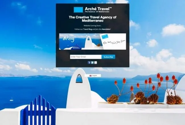 Arche Travel excels with its coming soon page by seamlessly integrating the page's color scheme with its brand colors. The agency draws inspiration from Greece, showcasing picturesque images of perfect tourist destinations. The crisp white buildings against the calm blue sea are particularly inviting. In addition to the main image, Arche Travel smartly incorporates a smaller version within the content frame, complementing their blue-themed coming soon logo and a customized subscribe button. This cohesive visual presentation captures attention and effectively reinforces their brand identity.
14. Crater
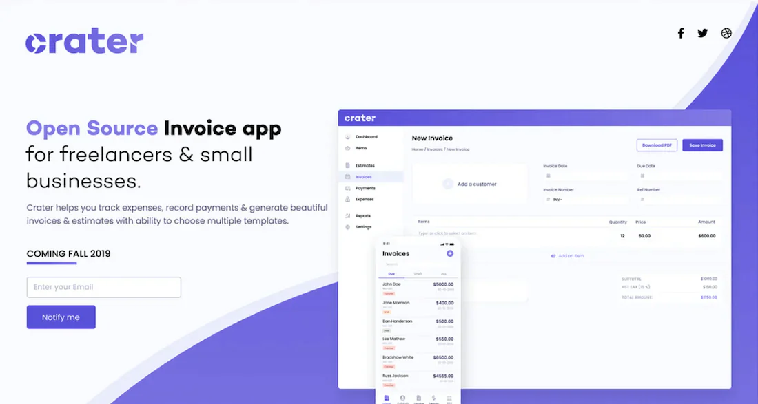 Crater's coming soon landing page exemplifies simplicity and effectiveness. Engaging visuals offer a preview of the product's final look, appealing to freelancers and small business owners by illustrating what they can anticipate upon launch. The well-crafted headline and message clearly communicate the product's unique value proposition. Addressing the pain points of freelancers and small business owners, Crater promises to streamline expense tracking and facilitate the creation of polished invoices.
15. MyOwnCorks
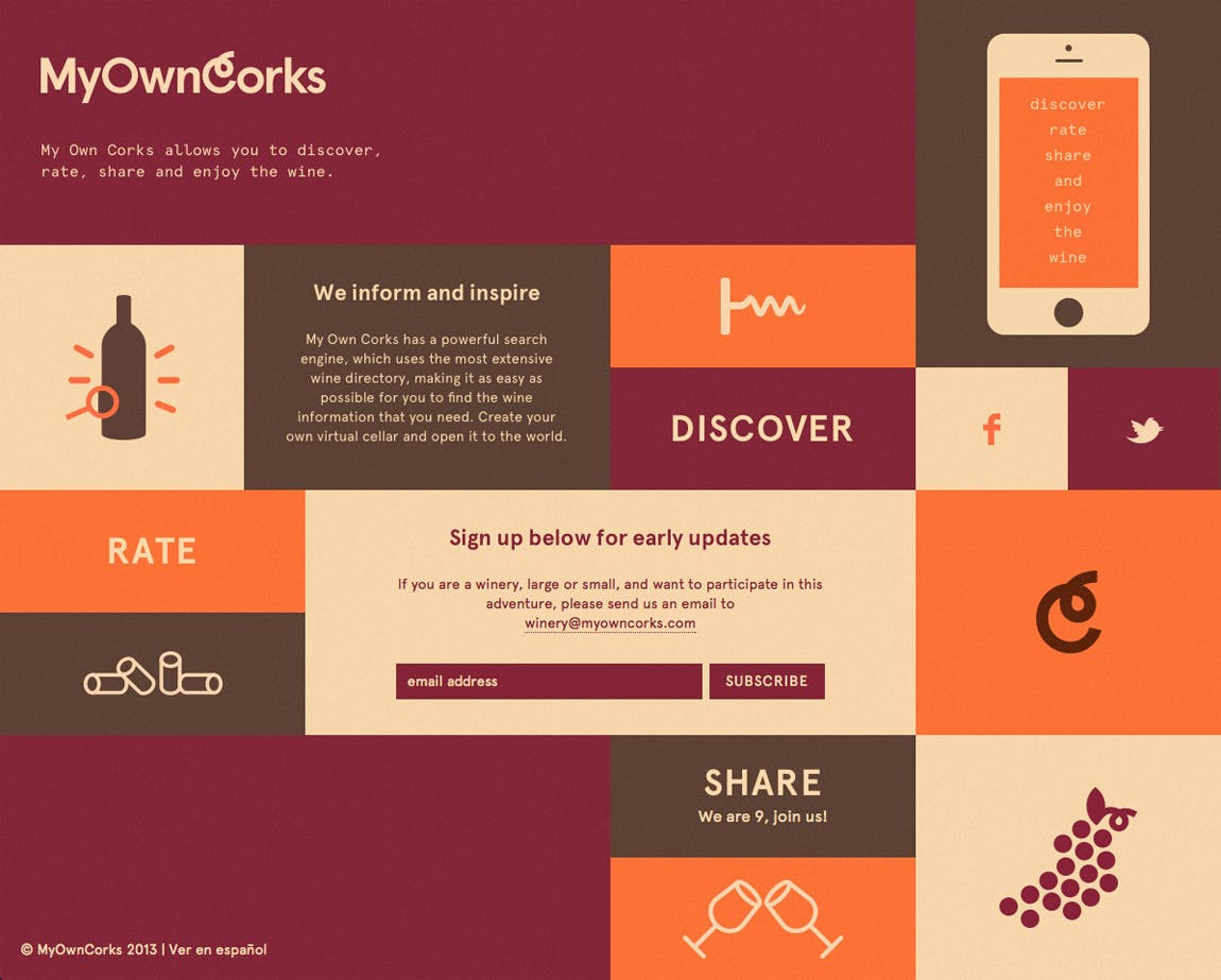 Calling all wine lovers! MyOwnCorks is tailored for enthusiasts like you. It aims to become your go-to search engine for wines, offering a dynamic tool to explore new flavors and enrich your wine experiences. Their coming soon page strategically employs a fundamental principle of consumer behavior—repetition. Notice how they emphasize words like "discover," "rate," and "share" throughout. This redundancy reinforces their core message, ensuring it resonates at a time when capturing attention is more challenging than ever.
